
Pulp fiction triptych
11×17 Type as Text
11x17 Type as Image
11×17 Type as Text & Image
Adobe Illustrator
Adobe InDesign
Client
Deliverables
Platform
Typography IV
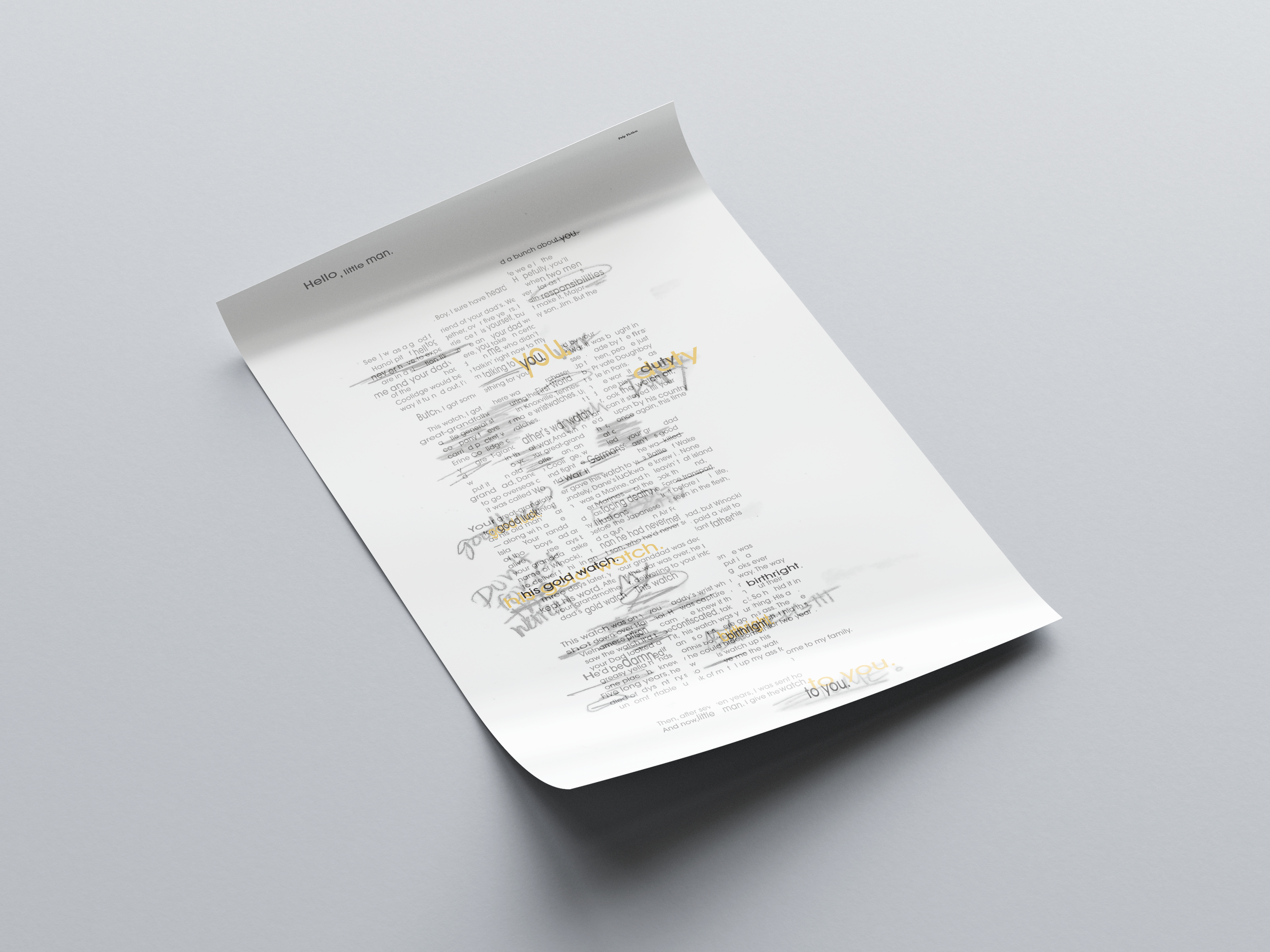
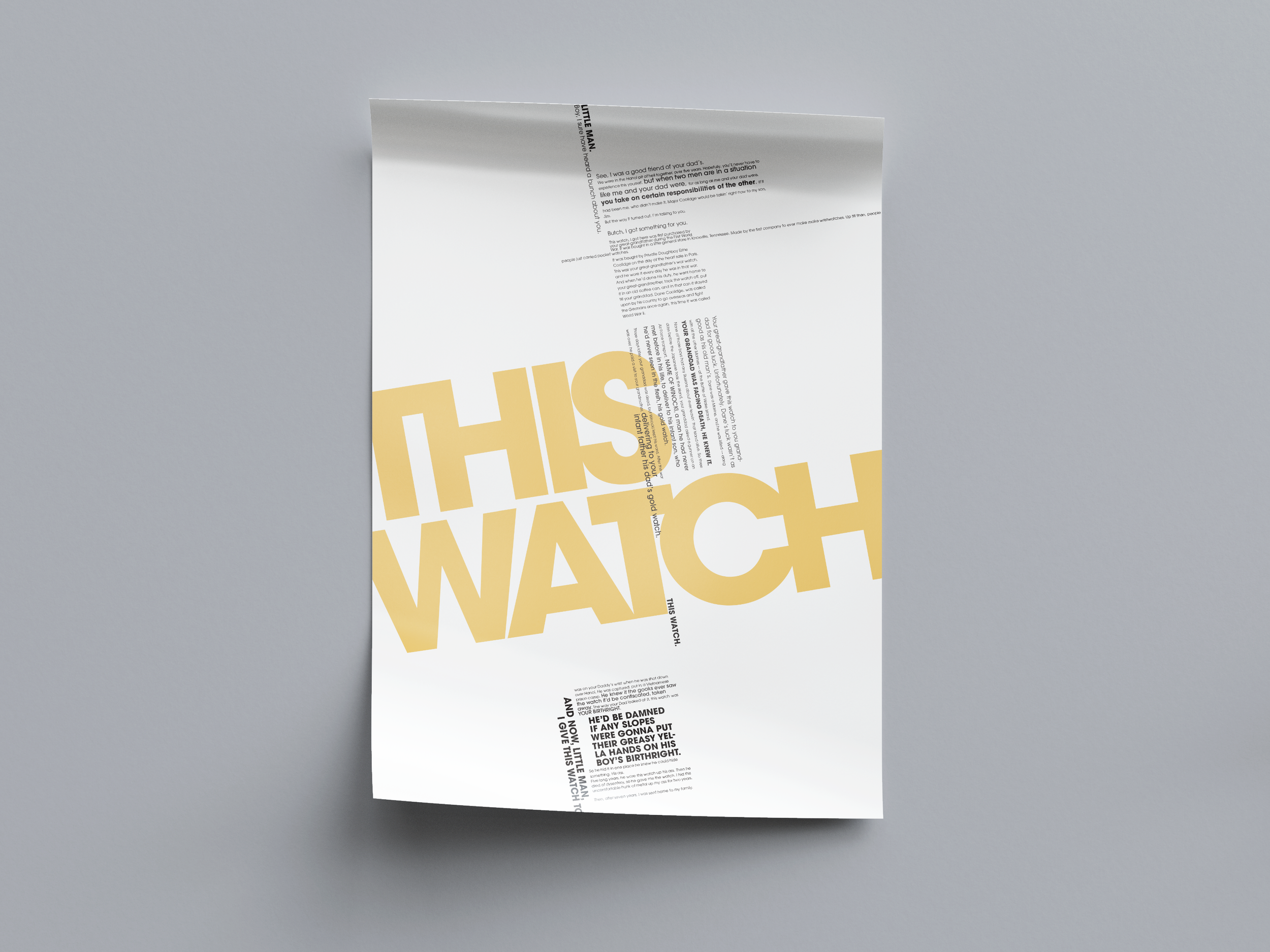
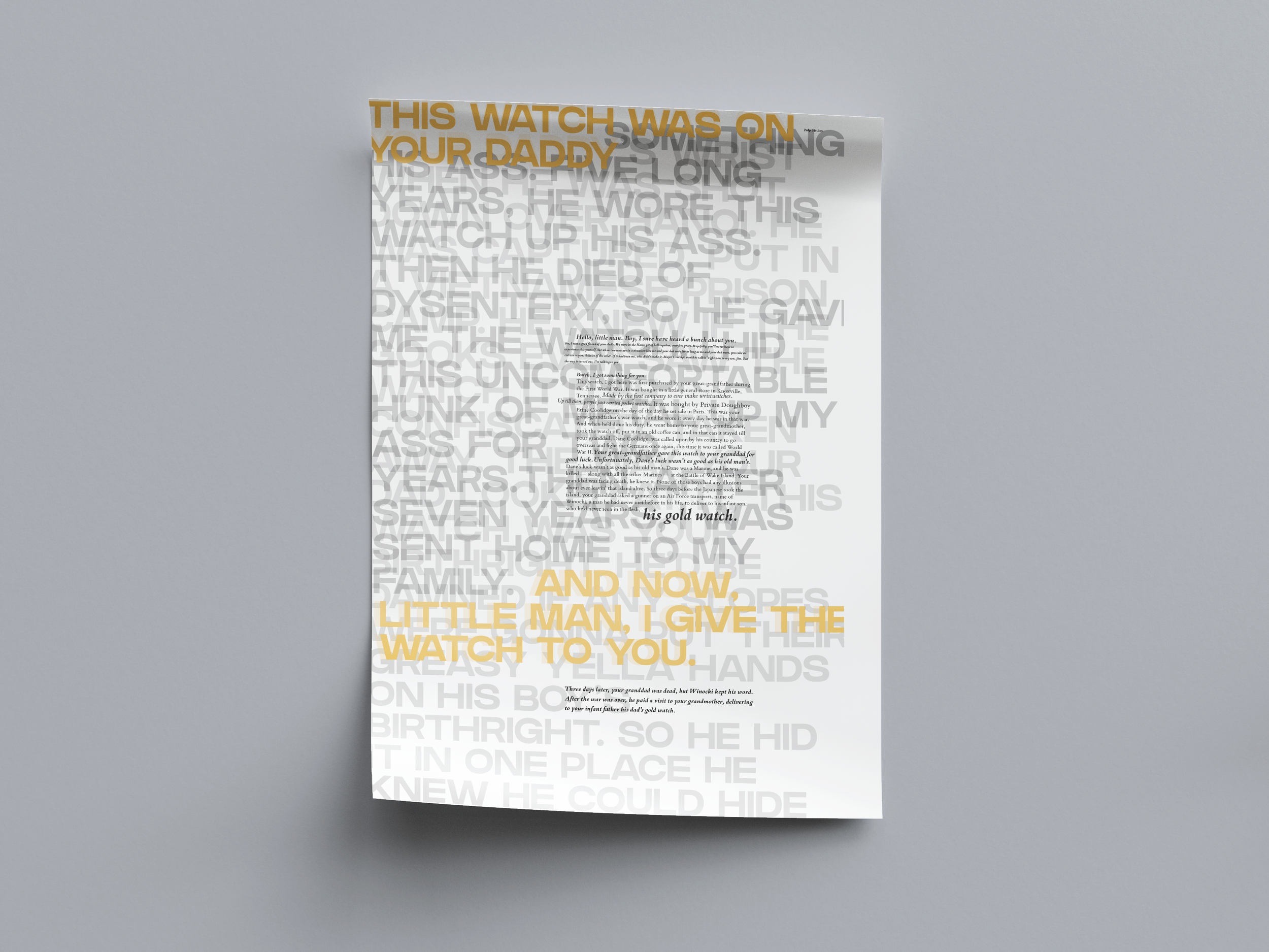
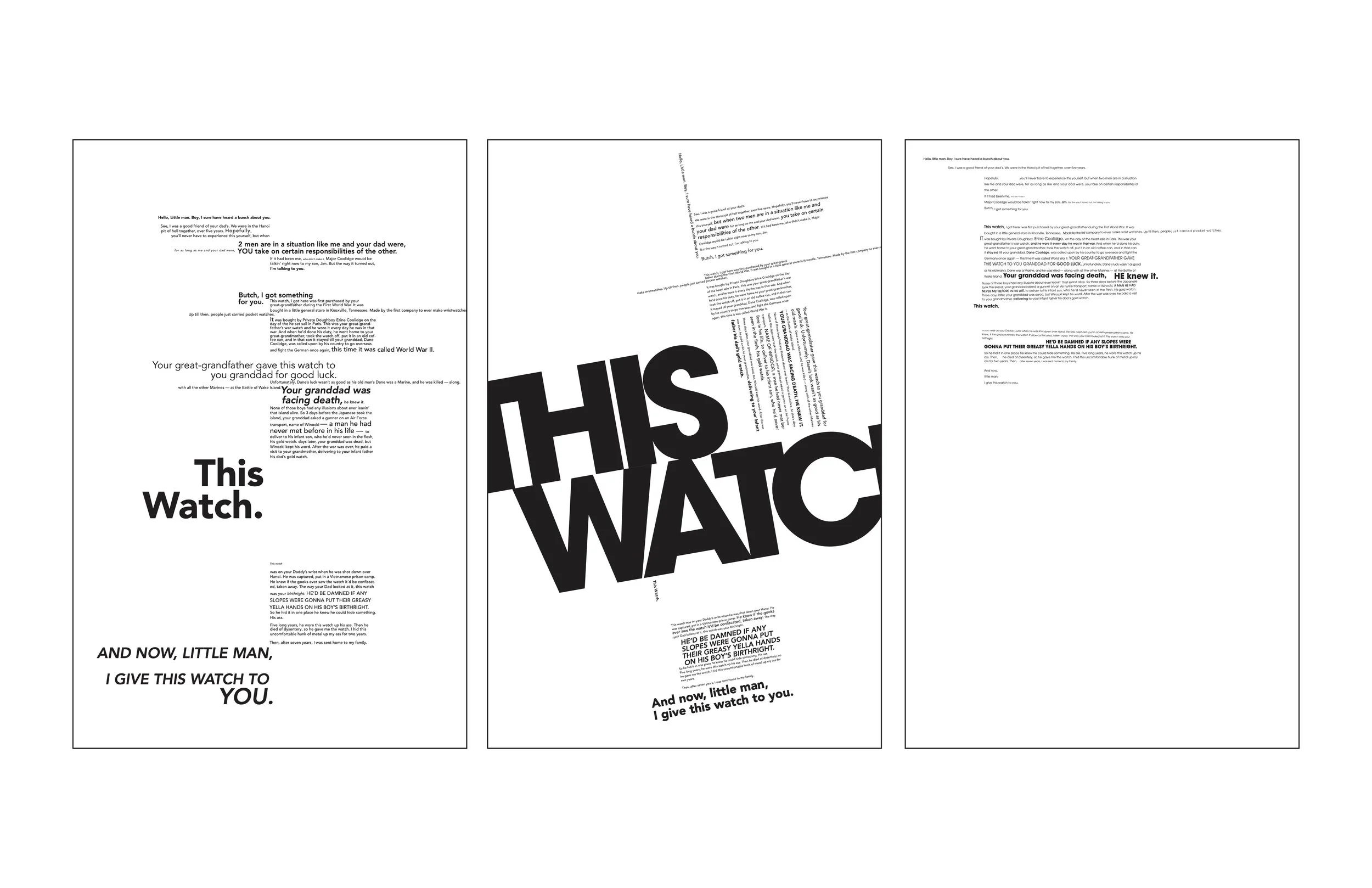
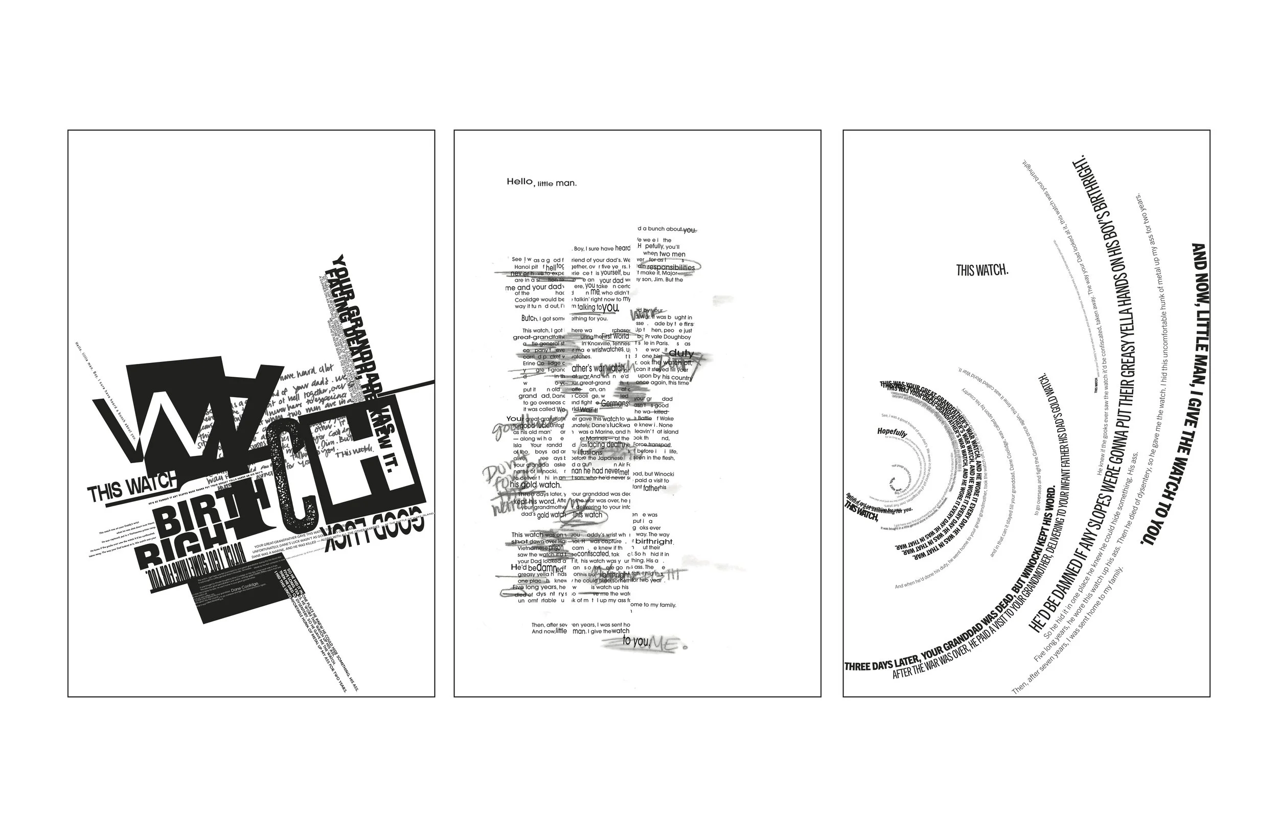
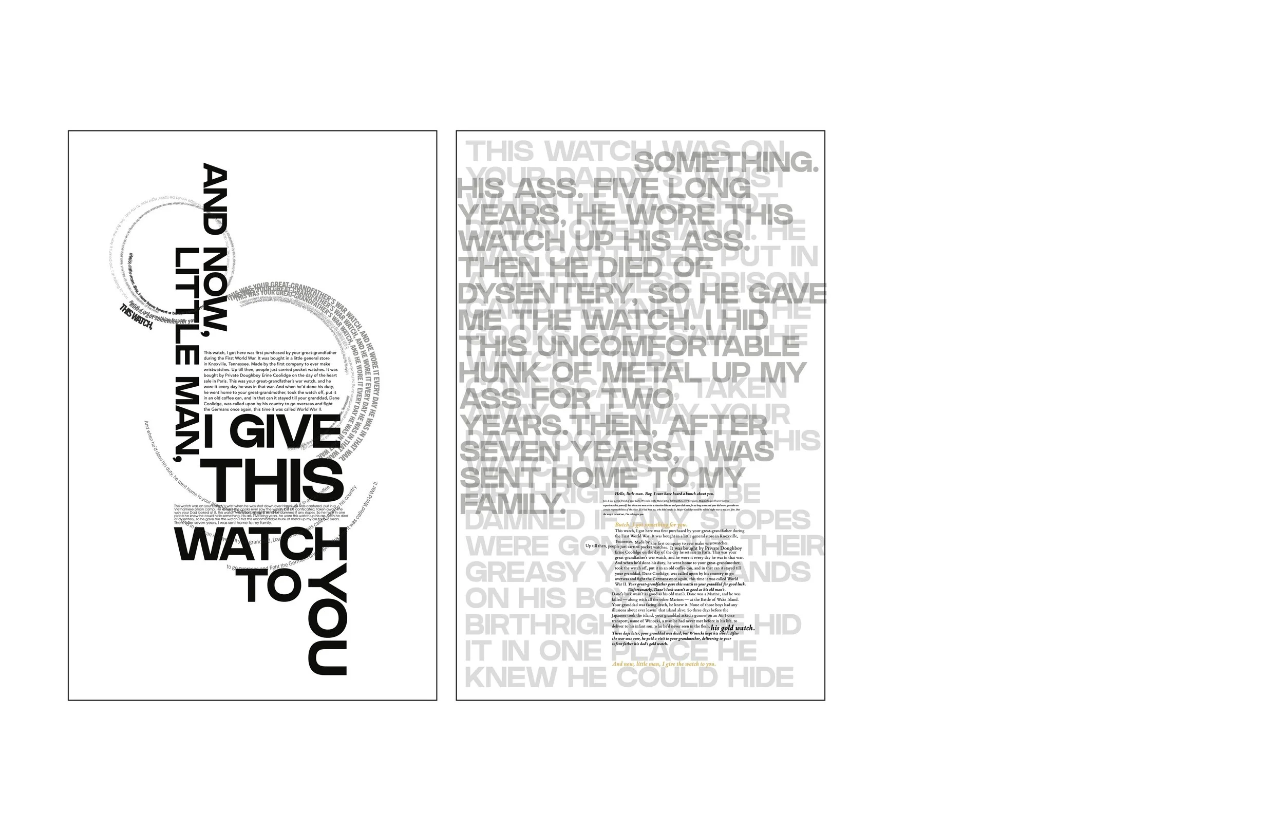
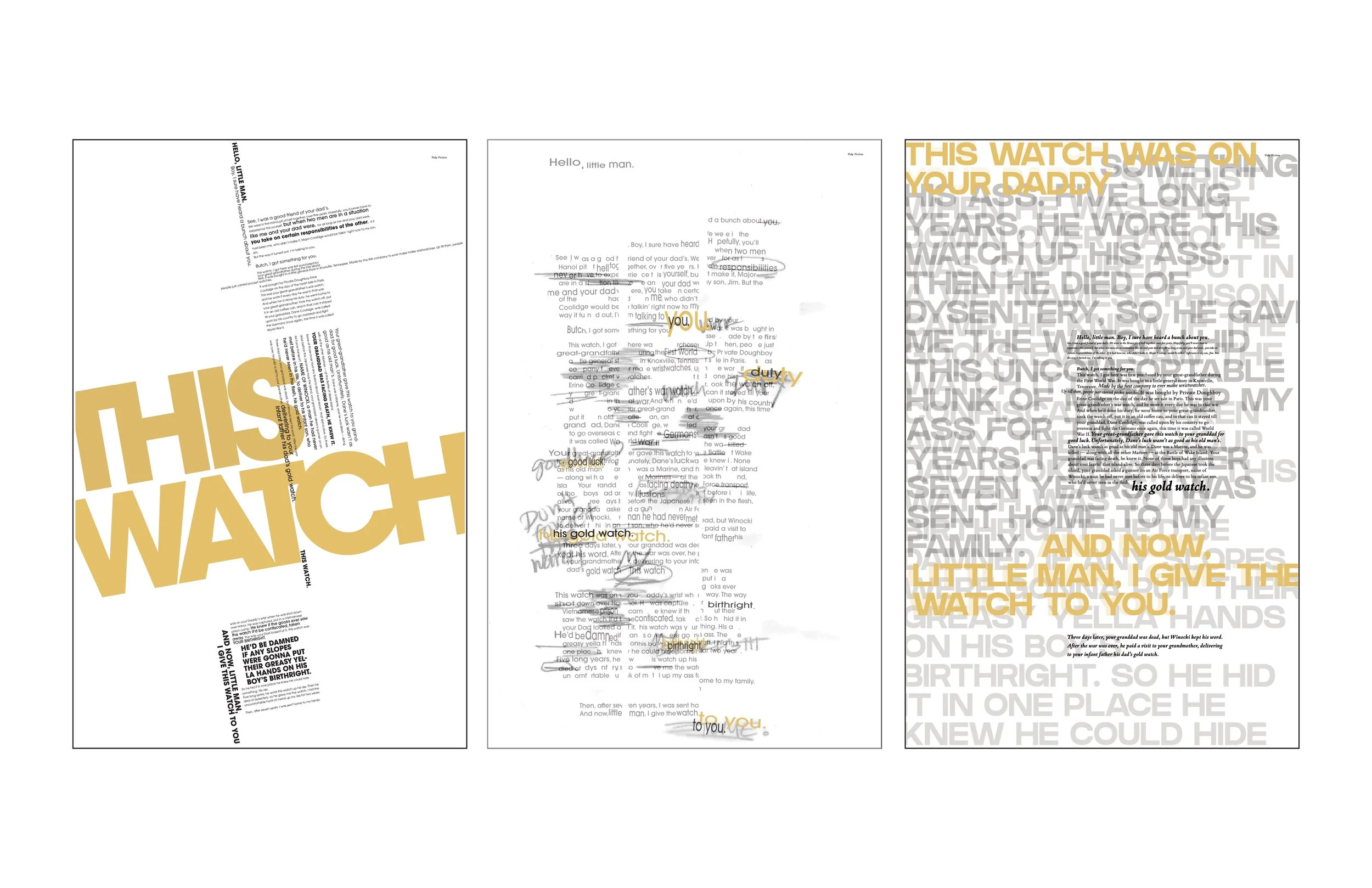
Pulp Fiction’s “The Watch” monologue recounts young Butch’s memory of receiving a war watch that has been passed down through generations of his family. Delivered through direct speech, the monologue emphasizes the sacrifice, endurance, and survival of his father, grandfather, and great-grandfather who carried the watch before him.
This project explores the expressive power of typography through three different visual approaches. The first poster presents the monologue in a structured, grid-based layout, using type primarily as text and emphasizing visual hierarchy. The second poster interprets the monologue using type as image, focusing on conveying the emotional weight of the story. The third poster combines both approaches—type as text and type as image—to visually communicate the narrative and atmosphere of the scene.
research
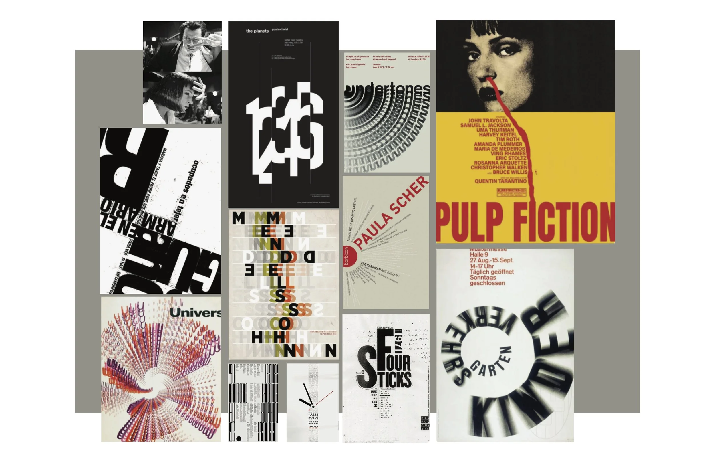
Moodboard
Typographical layout research for type as text, type as image, and a combination of the two. I wanted to find layouts that had an element of nostalgia and a way to capture memory.
Process
type as text Layouts
Type as Image Layouts
Type as text & image
deliverables
Final Triptych
mockup
posters